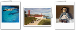
I'm nearly done with my Chinatown painting. I think I'll be finished after one more session.
I got a lot done today. I started by putting more detail in the two main figures (which are Dick and Spencer, by the way).
I also worked out the color a bit more throughout the entire painting, reworking the various creams, reds and blues.
I added the Chinese characters on the banner, which I think pieced the whole thing together. I tried to not be too precise with the Chinese characters. I learned this tip when I did the lettering on the corner store of my Dolores Street painting. Dean explained to me then that if the lettering on a painting is too precise (compared with the looser style of the rest of the painting) then the lettering will stand out, and will automatically draw the eye of the viewer. So, my Chinese lettering isn't precise at all, and I tried to blur the edges a bit. Granted, I can't read Chinese at all, but I think it looks decent.
I may have mentioned it before, but the style of this painting is quite different from the last few that I've done. It's a bit more of an abstract. I'm trying concentrate more on blocks of color, rather than specific shapes. It's interesting to see how those various forms of color connect with each other once I step back and really take it all in together.
In this photo, you can see the original photo on which this painting is based. Hopefully, you can see that I tried to match the colors with the original.
Next session, I need to work on the figure in the foreground, and perhaps add a glaze to the banner and a few other places.
It's coming along. :)
Thursday, May 09, 2013
Subscribe to:
Post Comments (Atom)


1 comment:
Love it, Trina!
Post a Comment