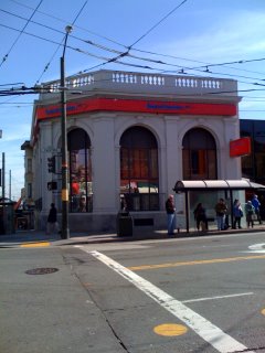
...as if the bright red ATM machines weren't bright enough...As I was walking along Castro Street yesterday, I noticed that they'd put the new BofA signs up.
You should know that the BofA building on the corner of Castro and 18th street is a really gorgeous old building. Now, while I appreciate that BofA needs to put up a sign letting customers know where they are, I really think they went overboard on this one.
The signs go around all 3 sides of the building. They are bright red and have that really cheap plastic look about them.
Don't they know that in this case, less is more?
Tacky.
Way to deface a building, BofA.
Friday, February 08, 2008
Subscribe to:
Post Comments (Atom)


No comments:
Post a Comment